Selected work(01) CASE STUDY 01 · HPLUZPRODUCT DESIGN — 2024

One care network.Three ways to say yes.(CS—01)

One app for a family’s healthcare — and the apps for the doctors, labs and pharmacies who answer it.

HPLUZ brings doctor and paramedic visits, lab tests, medicines, hospital beds and emergency help into one patient app, with companion apps for the doctors, labs and pharmacies who respond. I was the product designer, handling the design end to end over two months of a year-long project, working with developers, stakeholders and managers. The challenge was breadth: making very different kinds of care feel like one product without pretending they all work the same way.

Year
2024
Role
Product design
Team
Cross-functional
Platform
Mobile + web
Read time
5 min
FILM 01 · 0:27Book, Request, Alert — the product in 27 seconds. Designed screens from the Figma file, stepped through; silent.
(02) CONTEXT

One front door for a family’s care

02 / 10

Care rarely arrives as one service: a consultation, then a blood test, then a prescription — often for someone else in the family.

The patient app puts eight services behind one home screen, with a family health record and reminders around them. Every provider who answers those services has an app of its own and a desktop web portal, and an admin panel runs the network.

Patients
Book, order and request care for themselves and the people they look after.
Partners
Doctors, paramedics, labs and medicine stores, each verified before going live.
Operators
Set packages, test parameters, coupons, referrals and charges from the admin panel.
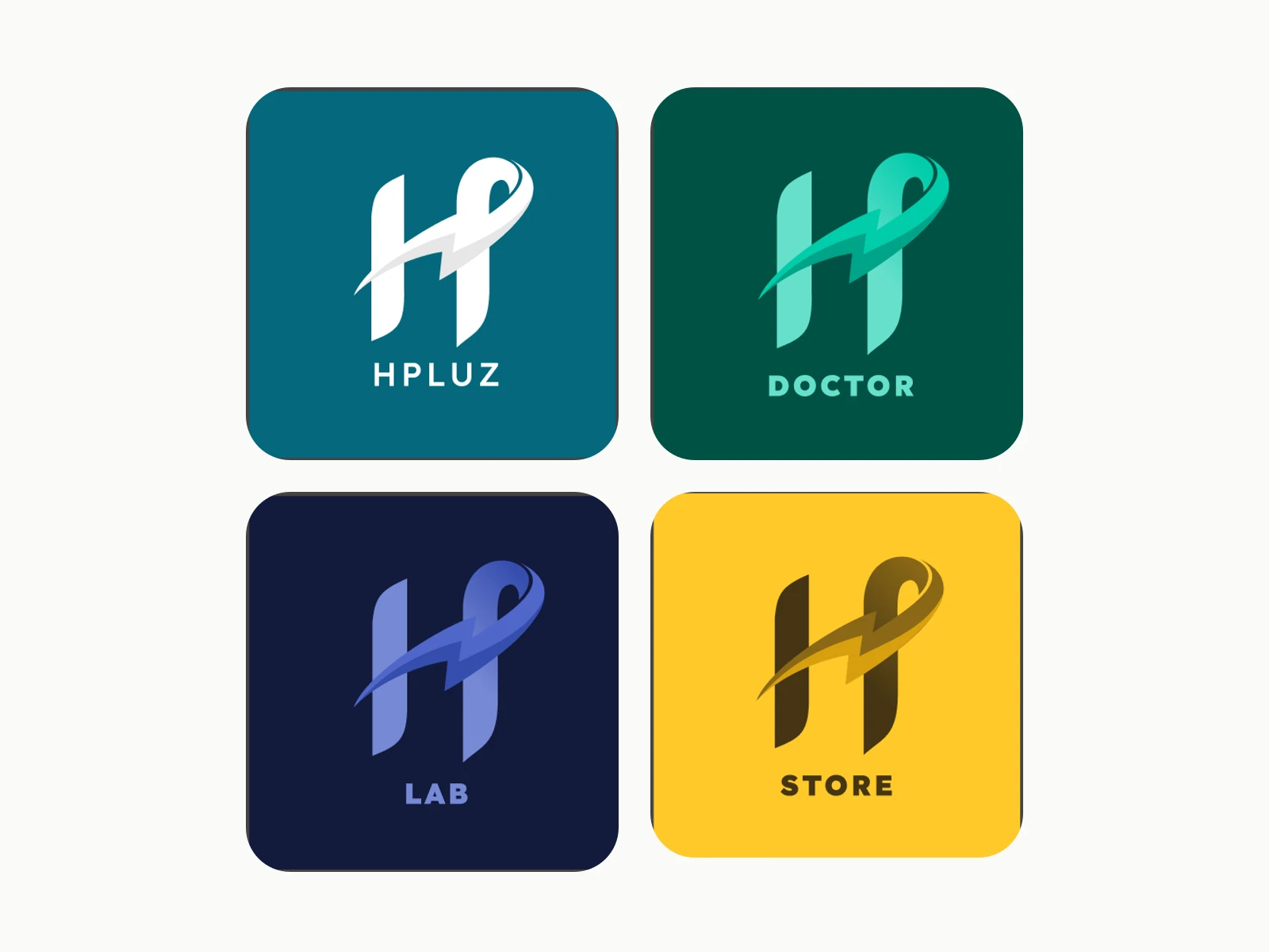
Four store tiles — HPLUZ, Doctor, Lab and Store — each above its app’s home screen.
FIG. 02.1Four apps, one mark: the patient app (HPLUZ) and the Doctor, Lab and Store apps, each in its own colour.
Map of the patient app’s 15 sections beside the Doctor, Lab and Store apps and the admin panel. Doctor consultation and Paramedic go to Doctor, Lab Test booking to Lab, Medicine Ordering to Store.
FIG. 02.2The whole system as the file names it. Tags mark which patient services land in which partner app.
(03) APPROACH

Same app, different rules

03 / 10
(03) THE REFRAME

A doctor has slots. A lab has to accept. A pharmacist has to see the prescription. An emergency can’t wait for any of it.

My reading of the flows — the file holds no research notes, so this is inferred, not a finding.

One booking flow for everything would be easy to learn and wrong for half the services; a flow per service would turn one app into eight. So I gave every service one skeleton — who it’s for, a price summary, a booking with a plain status — that bends only at the moment of commitment. That moment has exactly three versions.

  1. Book

    Fixed capacity: a doctor’s slot, a paramedic visit, a hospital bed. See what’s free, pick it, pay at booking.

    CHOSEN OVER Request-and-wait for everything
  2. Request

    A professional checks first: a lab confirms collection, a pharmacist reviews the prescription. Ask, they accept, then pay.

    CHOSEN OVER Charging before anyone has said yes
  3. Alert

    Emergencies. No slots, no prices, no cart: a short form, one-tap answers, consent, send.

    CHOSEN OVER Pushing urgent help through checkout
Three crops: a doctor booking’s price summary with Proceed to pay; lab bookings where Pay now is disabled until the booking is accepted; the end of an ambulance request with consent checkboxes and Submit.
FIG. 03.1The three moments side by side: Proceed to pay on a doctor booking; Pay now waiting on a lab’s acceptance; an ambulance request ending in consent and Submit.
(04) BOOK

Book: from how you feel to a slot

04 / 10
DECISION 01

Let patients start from how they feel

“What symptoms you have?” with three symptoms selected, beside a list of 32 matching doctors.
FIG. 04.1The symptom picker, and the doctors it returns.
Problem

Most people can’t tell whether a symptom needs a dermatologist or a general physician. A specialty list asks them to diagnose themselves before they can book.

Reasoning

So Doctor consultation offers three ways in — specialty, symptom or body condition. The symptom picker asks for at least two symptoms: one more tap, in exchange for a narrower list. Browse all doctors stays one link away.

Design response

Chosen symptoms stay as removable chips, and Proceed returns matching doctors with rating, experience and clinic.

Evidence

Seen in the flows; the reasoning is mine, reconstructed from the design. The two-symptom minimum hasn’t been tested.
DECISION 02

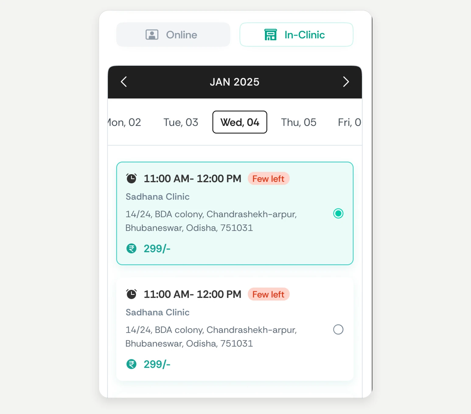
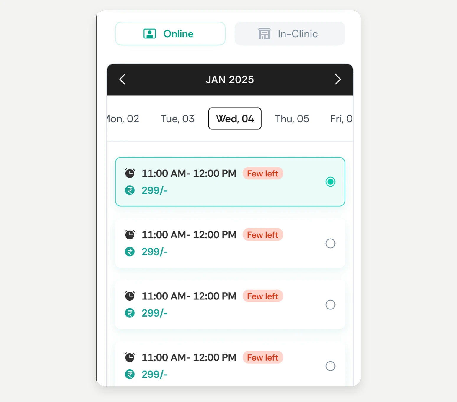
One booking screen, whatever the visit

Book consultation with In-Clinic selected: the same slots, each with the clinic’s name and address.
Book consultation with Online selected: date strip and time slots with prices.
OnlineIn-clinic
FIG. 04.2Same screen, two modes — drag to compare.
Problem

Doctors see patients online and in clinic; paramedics visit homes or work from a clinic. A screen per mode would mean learning to book four times.

Reasoning

Mode is one choice among doctor, day and time, so it’s a toggle on the same screen rather than a fork earlier in the flow. Comparing an online slot with a clinic slot costs one tap.

Design response

In-clinic slots carry the clinic’s address; every slot shows its price and a Few left flag. Paramedic booking reuses the screen with Home in place of Online.

Evidence

Seen in the flows: Online, In-Clinic and the paramedic version.

(05) REQUEST

Request: pay only after a partner says yes

05 / 10
DECISION 03

Put payment after acceptance

Patient lab bookings — one Requested with Pay now disabled, one Accepted with Pay now — beside the Lab app showing Approval pending with Reject and Accept.
FIG. 05.1Left, the patient’s lab bookings — the first can’t be paid yet, the second can. Right, the Lab app, where that yes is given.
Problem

A lab test needs someone to collect a sample; a medicine order needs a pharmacist to accept the prescription. Charging first turns every rejection into a refund.

Reasoning

So the patient asks, the partner accepts or rejects in their own app, and only then does Pay now light up. The cost is a second visit to the booking — so the status label has to carry a lot.

Design response

Lab bookings read Requested, Accepted, Collected, Completed, Rejected or Cancelled, and Pay now stays off until Accepted. Medicine orders work the same way. On the other side, the lab sees Approval pending with Accept and Reject; the store sees the order with its prescription.

Evidence

Seen across the patient, Lab and Store apps. The file shows the order of steps; the reason is inferred.

FIG. 05.2Pay now is off for a Requested booking and live for an Accepted one; the lab accepts in its own app. Designed screens, side by side.
(06) ALERT

Alert: an emergency is not a booking

06 / 10
DECISION 04

Seven short forms, not one checkout

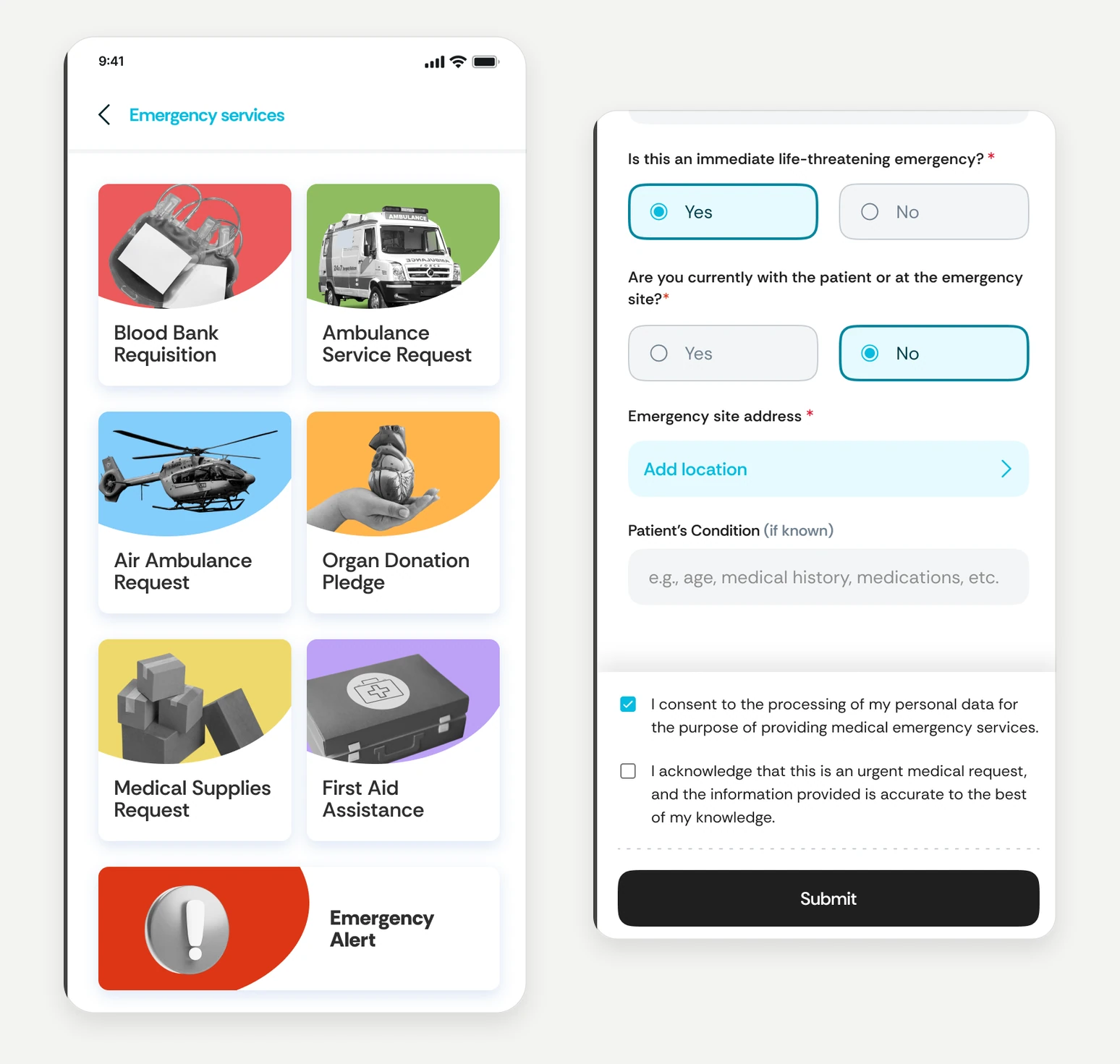
Emergency services menu with seven request types, beside the lower half of the Ambulance Service Request form.
FIG. 06.1Emergency services, and the half of the ambulance form that matters most.
Problem

Blood, an ambulance, an air ambulance, first aid: none of it has slots or prices, and every second spent in a checkout is wrong.

Reasoning

Seven specific forms instead of one generic one. They share a core — name, age, phone, address — so they stay learnable, and each adds only what its situation needs, mostly as checklists and one-tap answers.

Design response

Urgency is a yes/no tap, not typed text, and every form ends with consent before Submit. Emergency Alert covers the rest: a general, police, fire or medical alert.

Evidence

Seen in the flows. The file stops at Submit — what the requester sees next isn’t designed yet.

FIG. 06.2Emergency services to an ambulance request: two one-tap answers and consent, down to Submit — where the designs end.
(07) BOTH SIDES

One booking, both sides

07 / 10

The same consultation, followed from the patient’s home screen into the doctor’s day — and back.

  1. Find a doctor

    Doctor consultation sits first on the home screen; search, a specialty or symptoms lead to doctors.

    The HPLUZ home screen and a list of doctors.
  2. Pick a slot — and the patient

    Online or in-clinic, a day and a time, then who it’s for: yourself or a saved family member.

    Book consultation with slots, and the Select family member sheet.
  3. Pay, then track

    A confirmation with the booking number; from then on it lives in Bookings, labelled upcoming, ongoing, completed or cancelled.

    Booking successful dialog, and the Bookings list.
  4. The doctor’s view

    In the Doctor app the booking lands in the doctor’s day: today’s bookings, open slots, each slot’s patients.

    Doctor app home with today’s bookings and open slots, and Appointments for one slot.
  5. Consult, then close the loop

    Join now opens the online consultation. Afterwards the patient rates the doctor, and prescriptions reach the family’s health records.

    An ongoing booking with Join now, and Consultation completed asking for a rating.
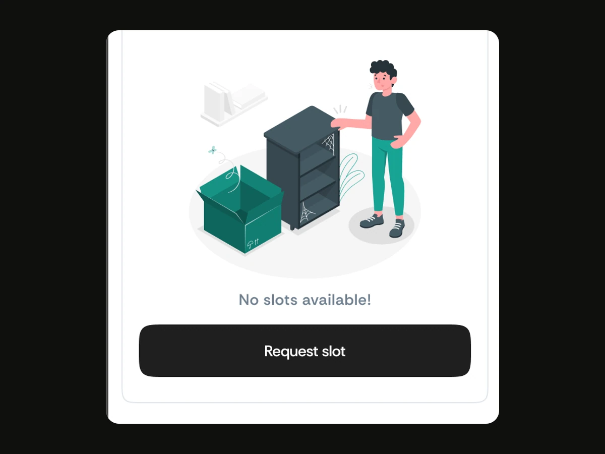
No slots available, with a Request slot button.
01 — No slots — request one
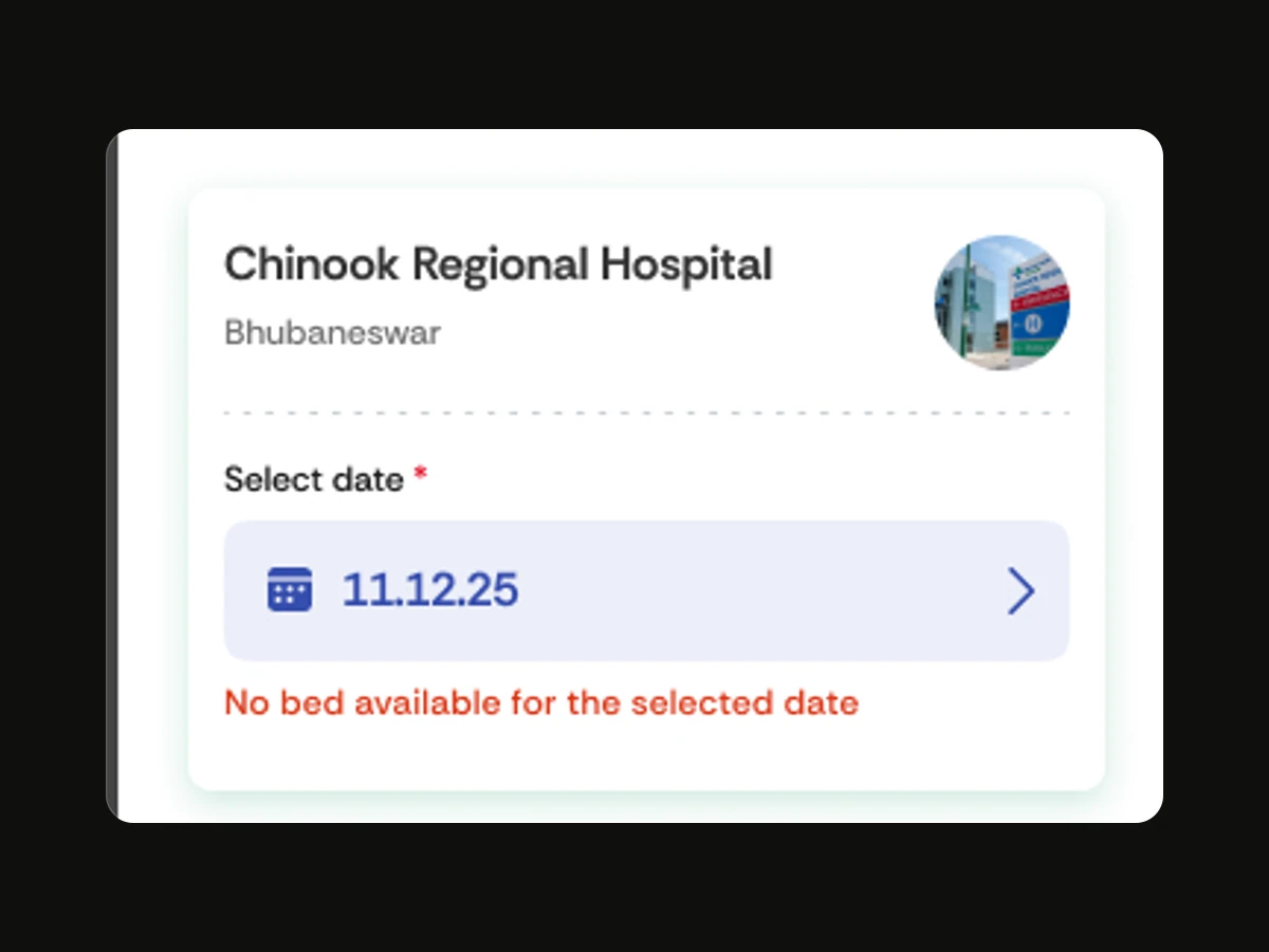
Book bed: No bed available for the selected date.
02 — No bed on that date
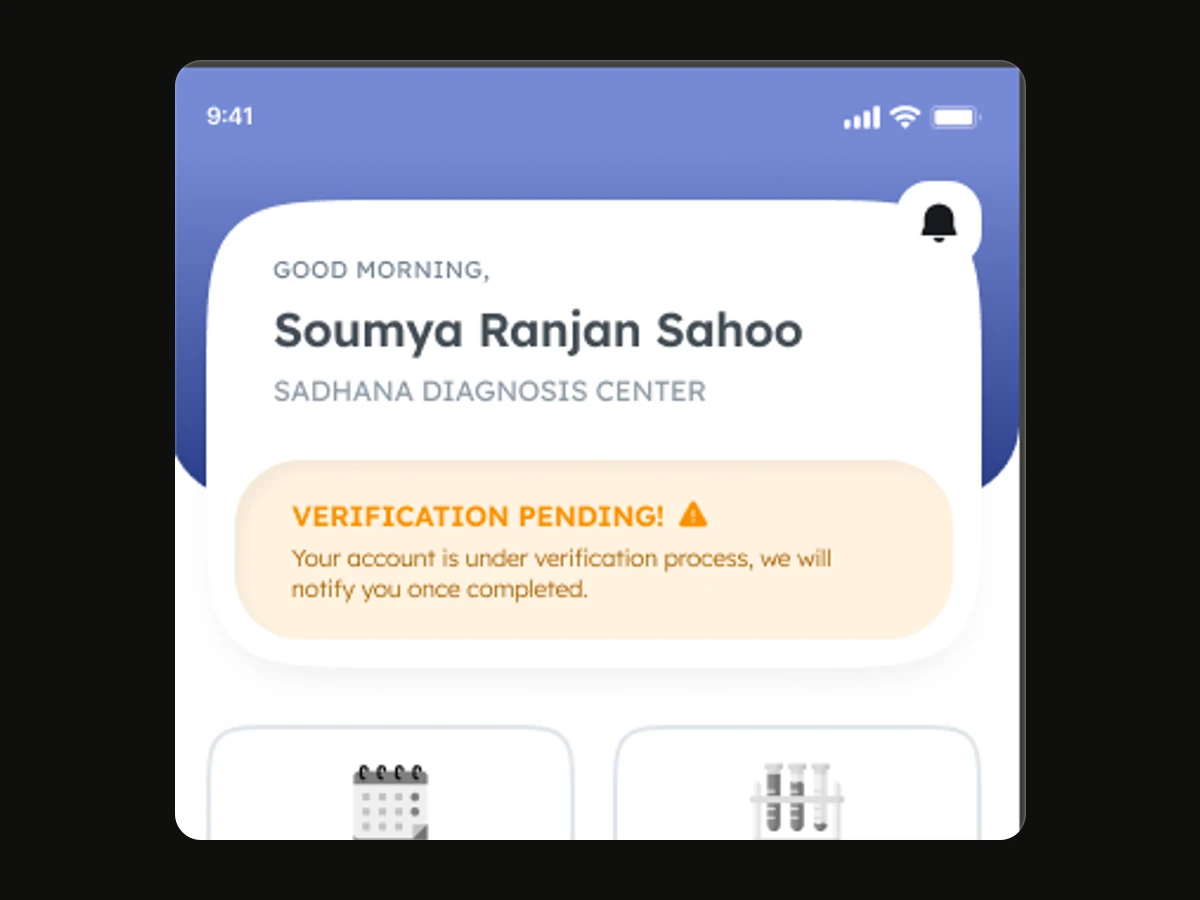
Lab app home: Verification pending — you’ll be notified once it’s complete.
03 — Partner awaiting verification
FIG. 07.2Every flow has a “not yet” — and each one says what happens next.
(08) PARTNERS

Built once, for three kinds of partner

08 / 10

Doctors, labs and pharmacies run different businesses, but need the same few things from HPLUZ.

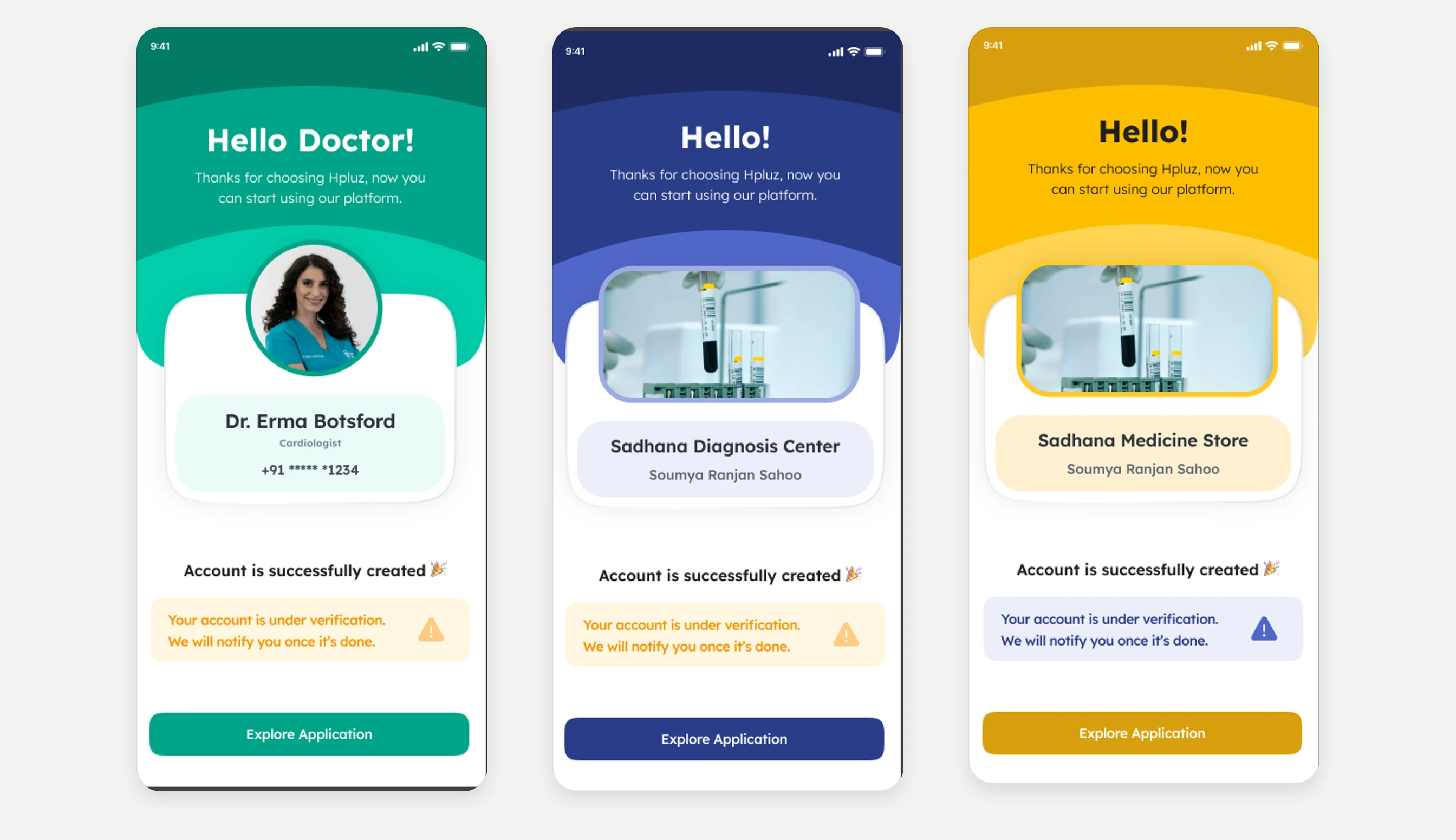
So their apps share one structure — sign-in, a business profile, verification, then a home with today’s work and earnings — and only the colour and core list change: appointments, test bookings or orders.

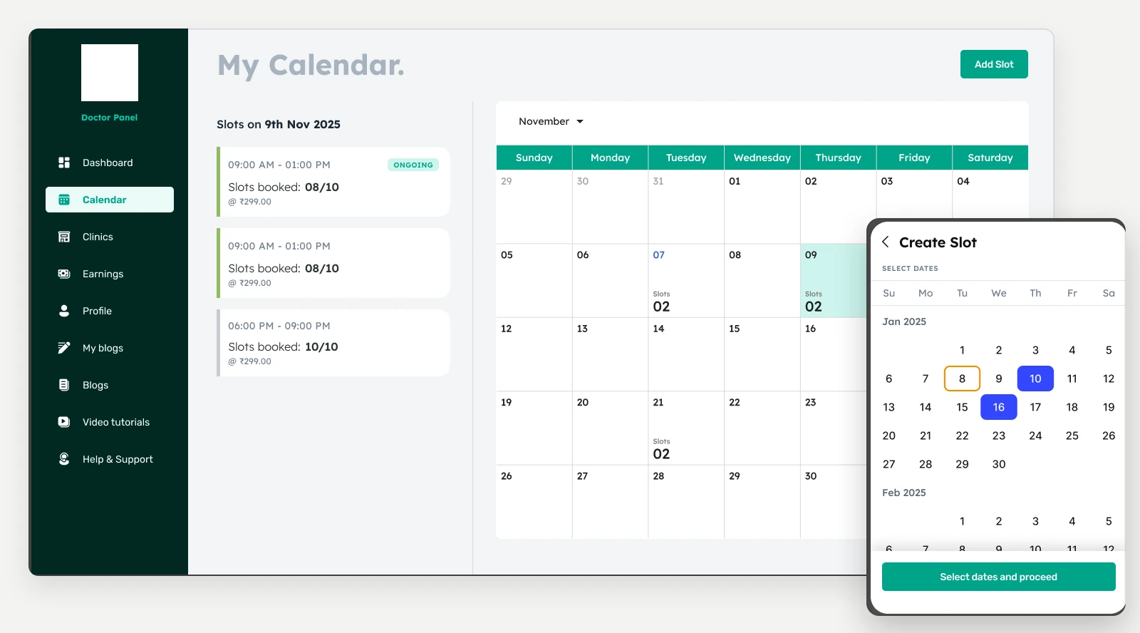
Planning happens on a desktop web portal: a doctor sees a month of booked slots and creates slots for several dates at once. The Doctor app is for the day itself.

Doctor, Lab and Store apps showing the same screen: account created, verification pending.
FIG. 08.1The same moment in three apps: account created, verification pending.
Doctor web portal My Calendar with slots booked per day, and the Create Slot date picker.
FIG. 08.2The Doctor web portal, a desktop tool: booked slots per day, and Create Slot for several dates at once. On phones it keeps its desktop width and scrolls sideways.

Colour does the wayfinding.

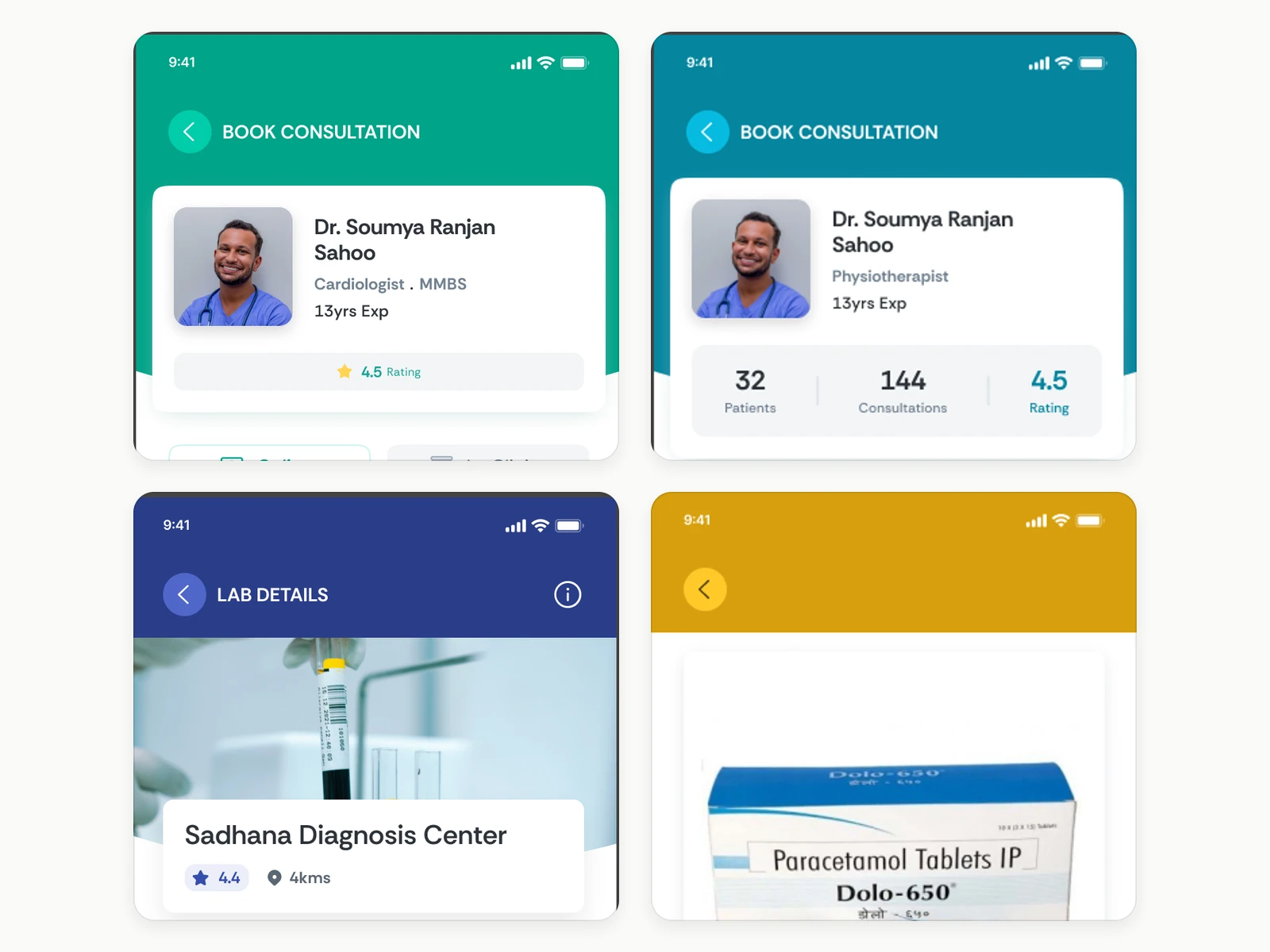
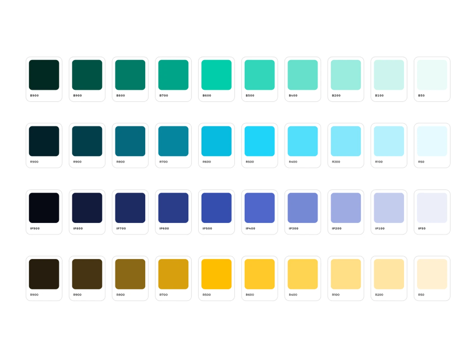
In the patient app, services a partner fulfils borrow that partner app’s colour — consultations green, lab tests indigo, medicines amber — so you always know which part of the platform you’re in. Underneath, the parts are shared: the same price summary, booking card, status label and filter sheet.

Four patient-app headers: doctor booking in green, paramedic booking in teal, lab details in indigo, a medicine page in amber.
Service colours
The H mark in four colours: HPLUZ teal-blue, Doctor green, Lab indigo, Store amber.
App marks
Four brand colour ramps from the Design Styles page: green, cyan, indigo and amber, each from 900 to 50.
Brand ramps
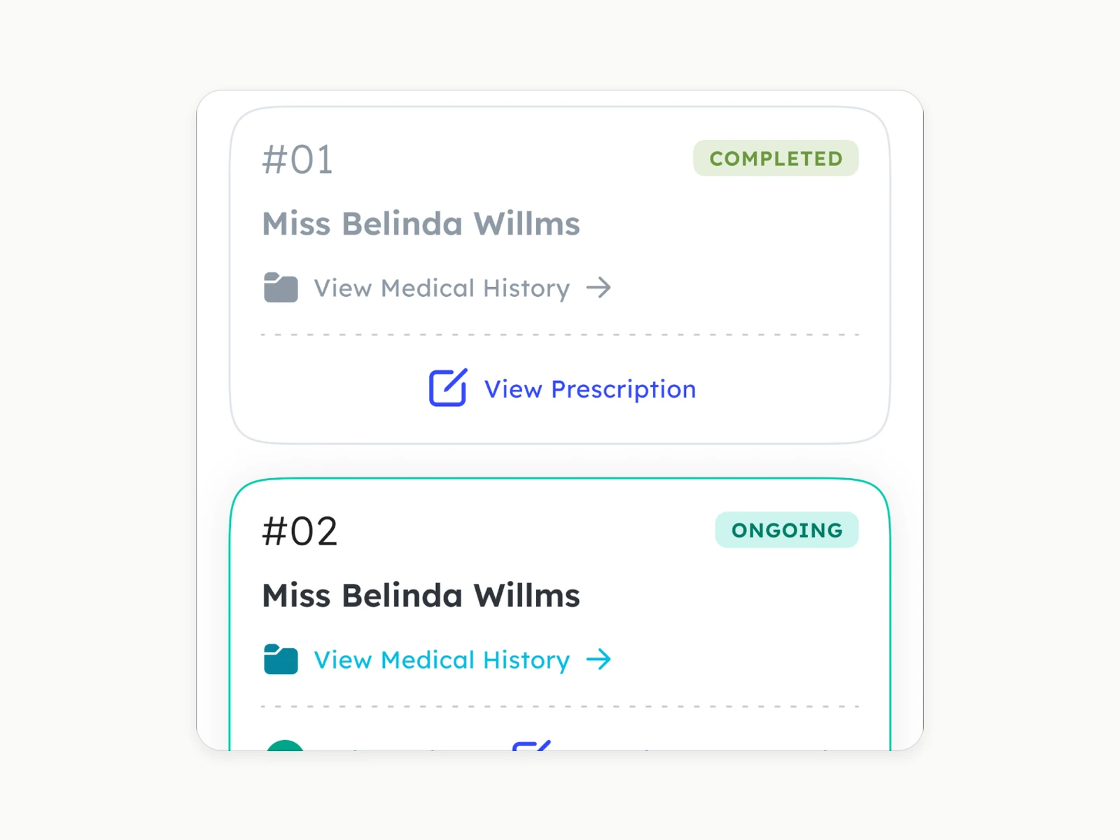
Two booking cards labelled Completed and Ongoing.
Status labels
FIG. 08.3Service headers from the patient app; app marks from the App Store set; brand ramps from the Design Styles page; booking cards from the Doctor app.
(09) OUTCOME

What was delivered, and what it can’t claim

09 / 10

    What the design made possible

    One patient app that holds eight kinds of care without forcing them into one flow; partner apps built from a single template; and a status vocabulary both sides of a booking read the same way.

    What remains unproven

    The material holds no usage data, testing or research, so this can’t speak to impact. Some screens still carry placeholder text, and nothing is designed for after an emergency request is sent.

    What I’d do next

    Design what happens after an alert is sent, test the two-symptom minimum, and make the “accepted — pay now” moment impossible to miss, with notifications to match.

    Delivered
    Design styles per app, flows for every role with their empty and confirmation states, a 23-section prototype, and App Store sets for all four apps.
    Scope
    4 apps, 3 partner web portals and an admin panel; 15 patient feature areas; 7 emergency request types.
    (10) CONTINUE

    Keep exploring

    10 / 10
    NEXT CASE STUDY — 04 · PRODUCT DESIGNPiepaye