Selected work(01) CASE STUDY 04 · PIEPAYEPRODUCT DESIGN — 2026

You write it down.The system adds it up.(CS—04)

A personal finance ledger that keeps the act of writing money down — and does all the arithmetic.

I designed Piepaye around an old habit: writing down what you spend. As its only designer I owned the product definition, interaction model, financial rules and visual system, and built it with AI coding tools. The core problem was a line to draw: what the person does deliberately, because doing it is the point — and what the system works out, exactly and unasked.

Year
2026
Role
Product design
Team
Solo + AI
Platform
Web app
Read time
3–5 min
FILM 01 · 0:28The idea in 28 seconds, then the running app: an expense recorded on a phone, a card bill that doesn’t count twice, and two headline numbers kept apart. Test build, fictional data, partly sped up; silent.
(02) PROBLEM

Keep the habit, lose the bookkeeping

02 / 09

Writing a line down creates a small pause between spending and noticing. The bookkeeping after it is what people give up.

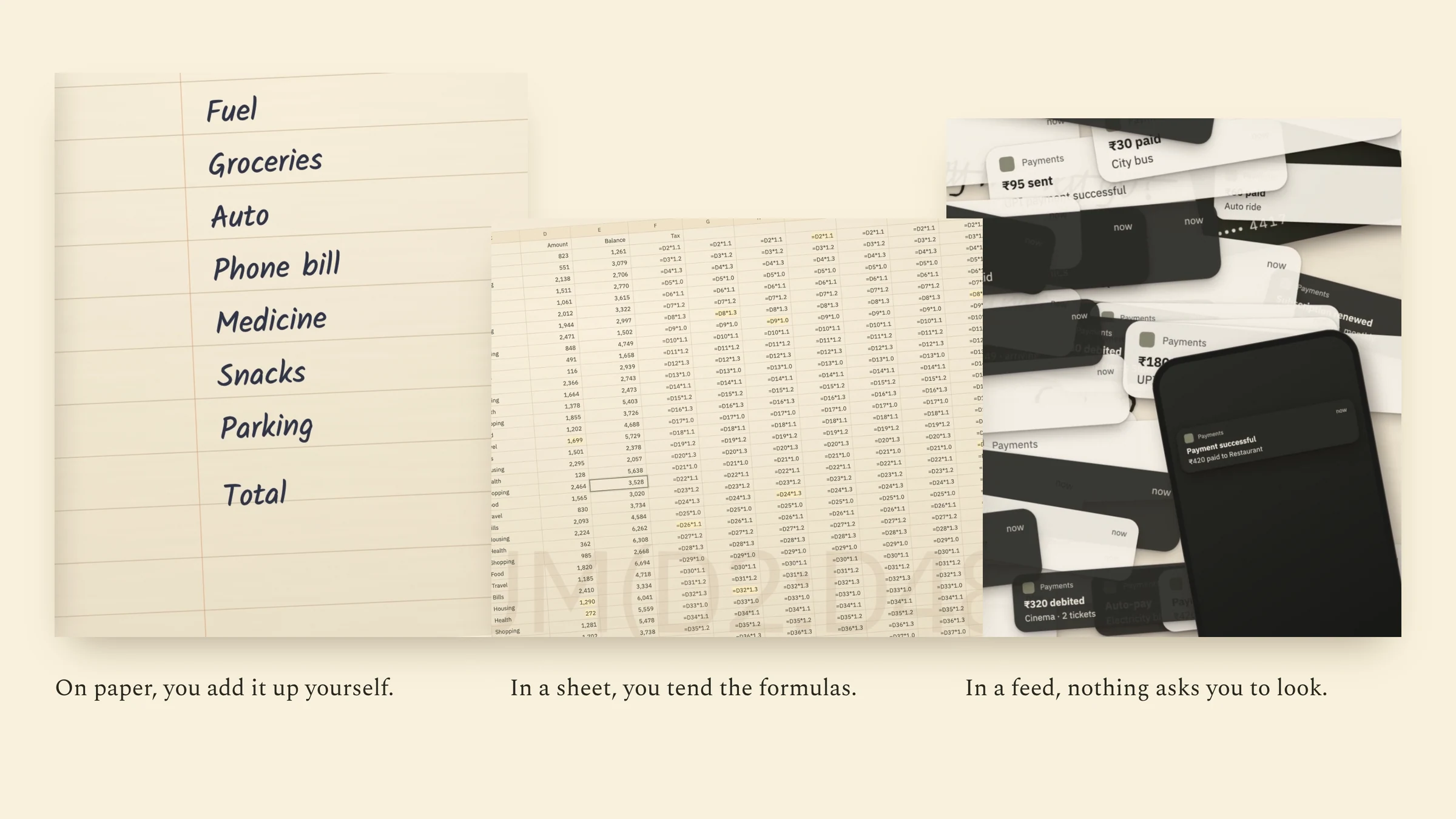
Paper makes you the calculator. A spreadsheet makes you its administrator. A bank feed removes the upkeep — and the moment of noticing with it.

Three film frames: a handwritten paper list, a dense spreadsheet, and an app’s imported feed.
FIG. 02.1Each familiar approach fixes one problem by giving up another — my observation, not research. Frames from a short film I made while designing Piepaye.
(02) THE REFRAME

How do you remove the work of keeping a ledger without removing the act of keeping one?

My framing — a hypothesis from my own habit, not a research finding.

I split the work in two. Saying I spent this, and what it was for, is the point. Every balance, total and budget that follows is consequence. The person does the first; the system does all of the second, exactly.

  1. Automate the repetition, not the decision

    Arithmetic is the system’s job; a judgement, even about a monthly bill, stays with the person.

    CHOSEN OVER Posting recurring bills on their own
  2. The ledger is the product

    Home is the list of entries; the totals sit above it, small, because the ledger produced them.

    CHOSEN OVER A dashboard of summary cards
  3. Numbers that match intuition

    Where a simpler model disagreed with how people think about money, the model gave way.

    CHOSEN OVER The simplest data model
(03) LEDGER

Recording is the interface

03 / 09
DECISION 01

Make the ledger the home screen
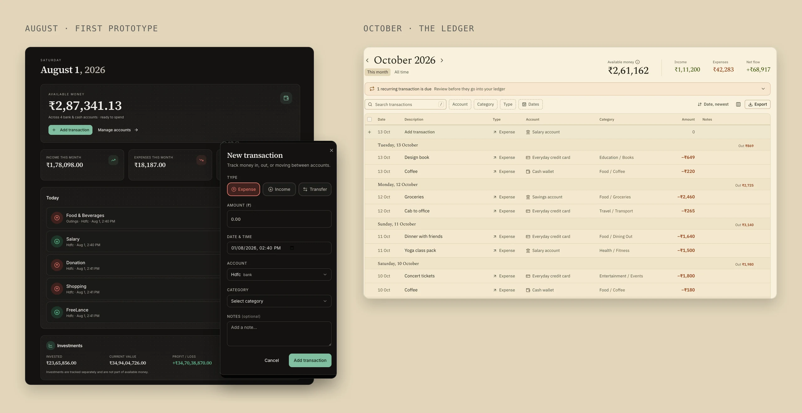
Left, the August prototype: a dark dashboard of cards with a New transaction modal. Right, October’s Home: a ledger of entries grouped by day under a compact summary.
FIG. 03.1Before, recording was a modal you went to. After, the ledger is the page, and the totals are what it produces.
Problem

My August prototype looked like most finance apps: summary cards and widgets, with every entry made in a modal on another page. It put the result at the centre and made recording a detour.

Reasoning

Recording has to happen where you’re already looking, fast enough to repeat daily. My rebuild brief said Home “should NOT be a conventional dashboard made of CRUD cards, forms, and widgets.” The trade-off: a dashboard reads faster at a glance.

Design response

Home became the month’s ledger, with a new row pinned at the top and compact totals above it. Piepaye suggests how you filed a description last time, but never the amount — that number is the habit.

Evidence

My August screenshots, the running app and my 30 September brief.
(04) MENTAL MODEL

Three entry types, one set of meanings

04 / 09

A finance app can be arithmetically correct and still wrong for the person using it.

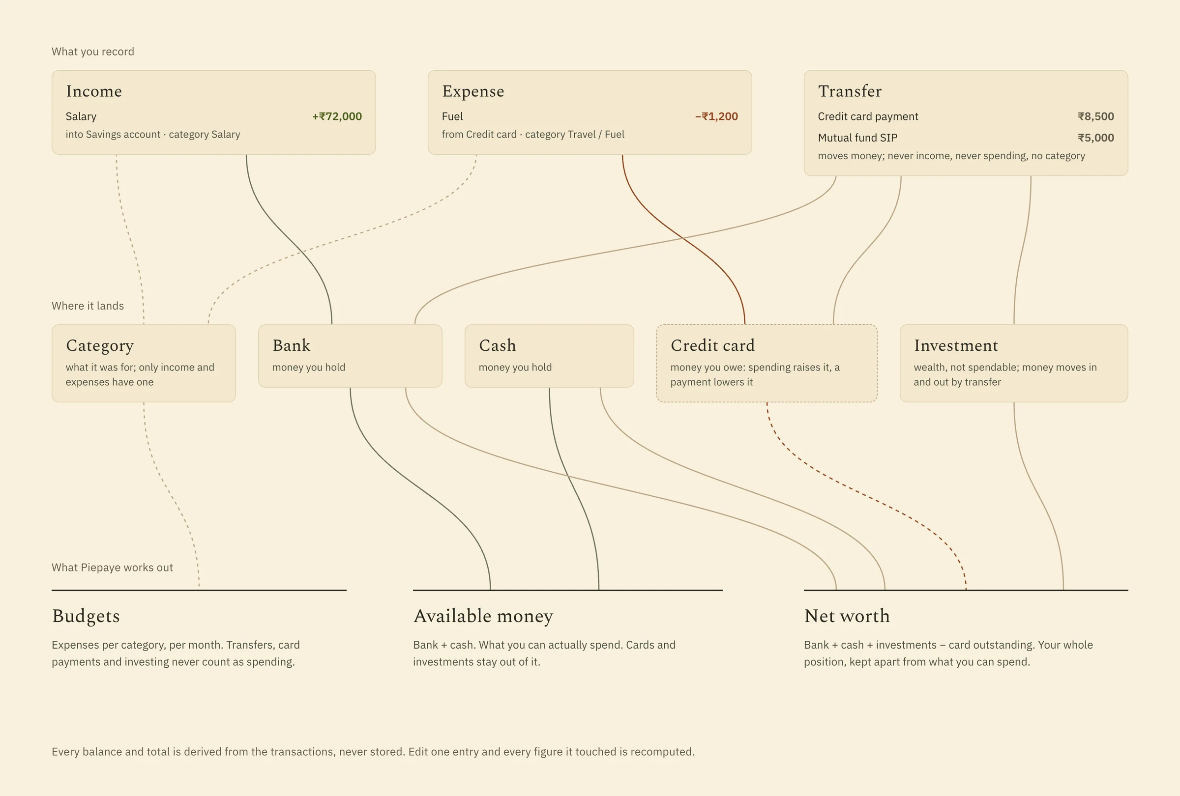
Moving money to savings isn’t spending; paying a card bill doesn’t buy anything. I settled on three entry types — income, expense, transfer — and derived every balance from them instead of storing it, so correcting one line corrects every figure that depends on it.

Diagram: income, expense and transfer entries flow into bank, cash, card and investment holders, and from there into budgets, available money and net worth.
FIG. 04.1The model I designed: what you record, where it lands, and what is worked out from it. The card is dashed because it is money you owe.
DECISION 02

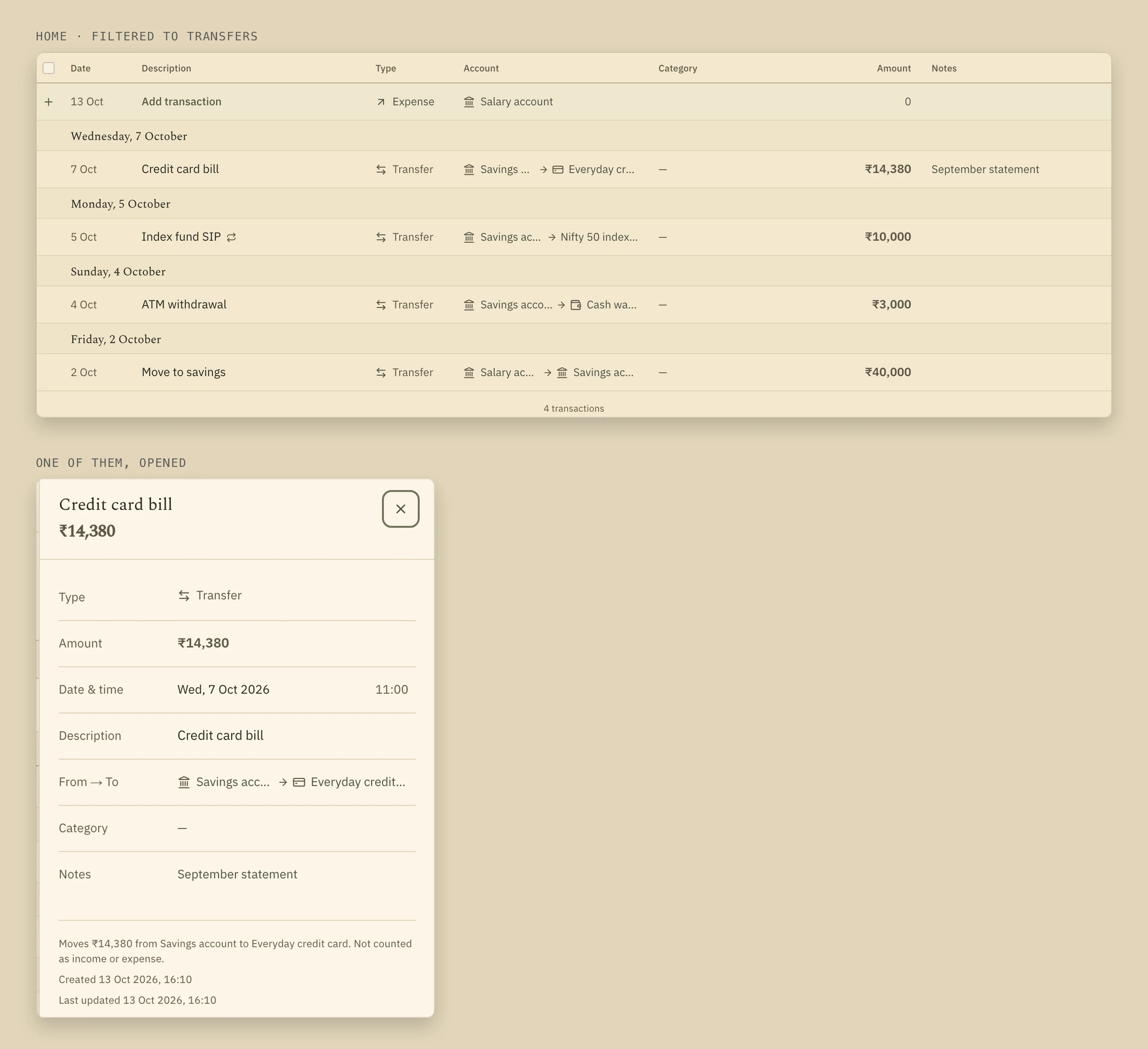
A card bill is not a second purchase

Ledger filtered to transfers, each shown From → To with no category, and a details panel for a credit card bill reading “Not counted as income or expense.”
FIG. 04.2Transfers are neutral — no sign, no category — and say in plain words what they don’t count as.
Problem

If every outflow is an expense, groceries bought on a card count twice: when you buy them, and again when you pay the bill.

Reasoning

I separated what an entry is from what it does. Its type answers “was this spending?”; its movements answer “which balances changed?” One extra choice when entering buys one rule for card bills, savings and investing.

Design response

A card is a debt. Spending on it raises what you owe; paying the bill is a transfer that lowers the bank and the debt together, marked “Not counted as income or expense.”

Evidence

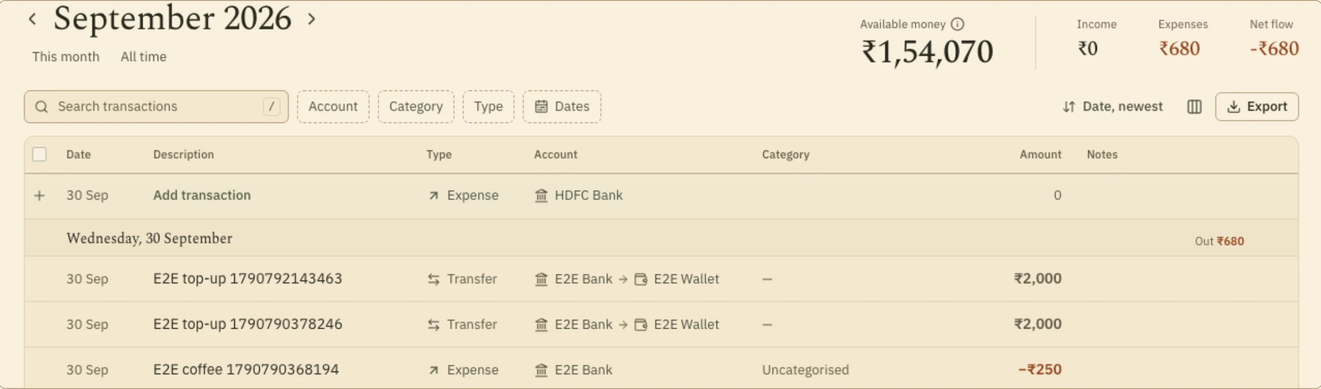
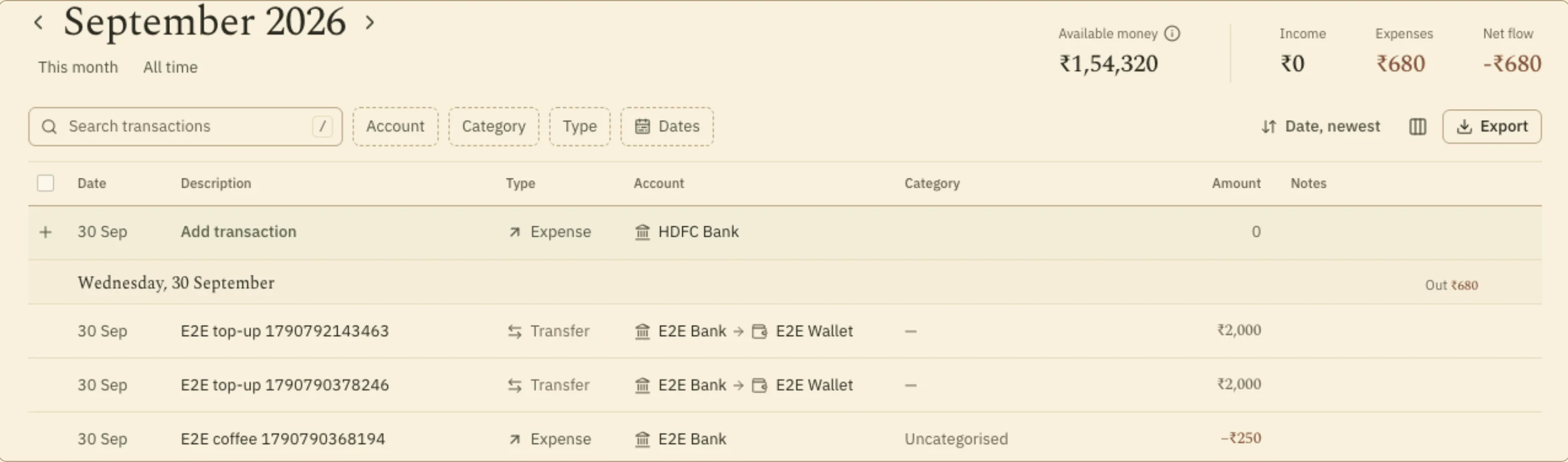
In the recording below, expenses read ₹42,283 before and after the bill.

FIG. 04.3A ₹10,042 card bill recorded as a transfer. Expenses stay at ₹42,283, because the purchases were already counted.
DECISION 03

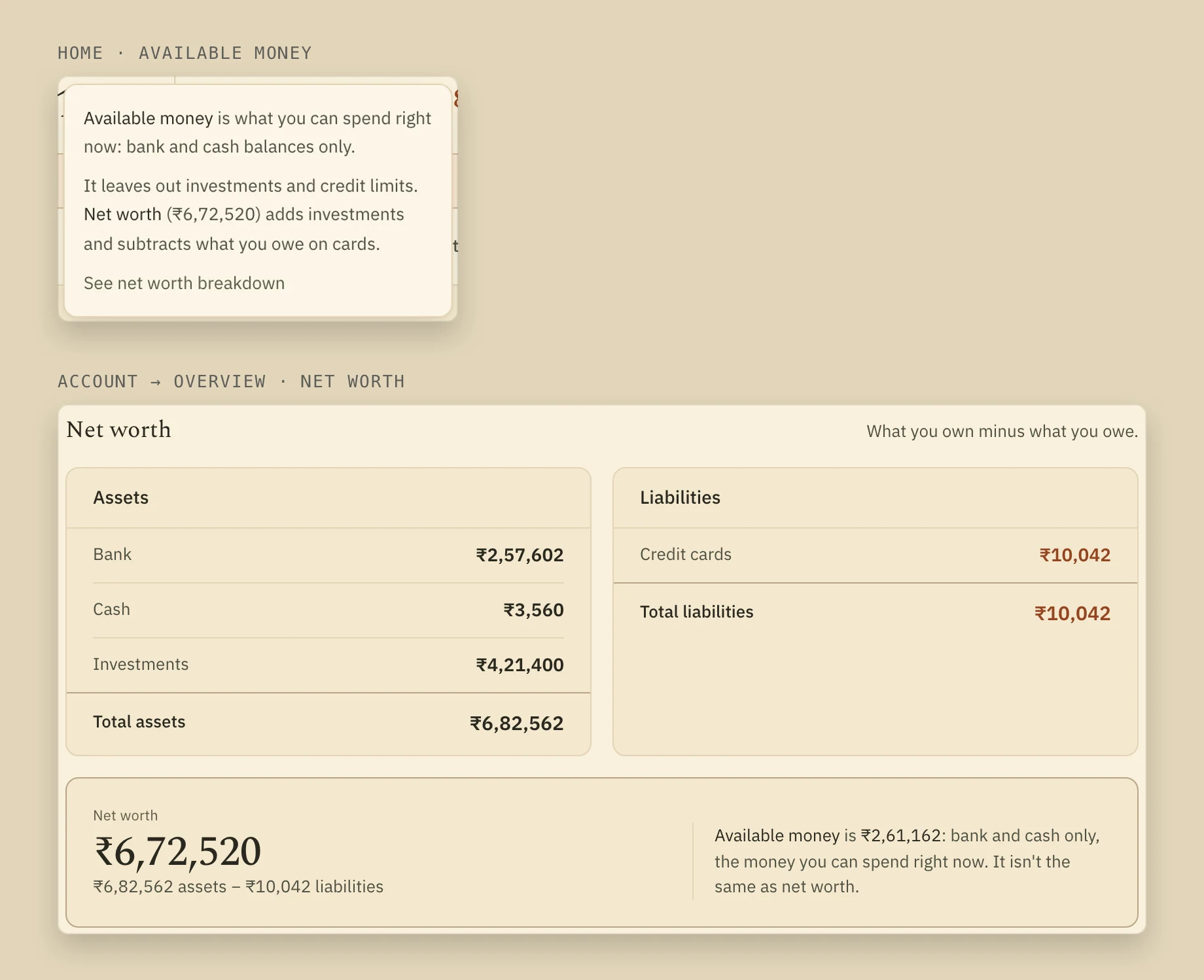
What you can spend is not what you’re worth

Popover on Home explaining Available money is bank and cash only; Account overview showing assets, liabilities and net worth with a note that it isn’t the same as available money.
FIG. 04.4Home explains what Available money leaves out; net worth sits one level away and spells out the difference.
Problem

One headline number can’t answer both “what can I spend?” and “where do I stand?”. Investments and unused credit make a thin week look comfortable.

Reasoning

I let placement carry the meaning: the spending number sits where you record spending; net worth, usually the more flattering figure, sits a level away. The first is the one that changes what you do this week.

Design response

Available money — bank and cash only — leads Home, with a note on what it leaves out. Net worth lives in Account → Overview, with a line saying how the two differ.

Evidence

Design rationale, not a tested finding.

(05) RECURRING

Automation that asks first

05 / 09
DECISION 04

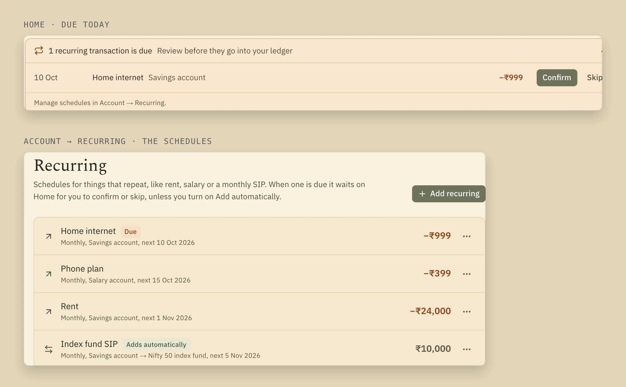
Recurring bills wait for a yes

A recurring Home internet bill due on Home with Confirm and Skip, above the list of recurring schedules, one marked Adds automatically.
FIG. 05.1A due bill waiting on Home, and the schedules behind it.
Problem

Rent, internet and a SIP repeat. Posting them automatically is the usual convenience — and it writes lines the person never decided to write.

Reasoning

A schedule is repetition; whether this month’s bill was the usual amount is a decision. The trade-off is one tap per bill each month, a fair price for knowing what went through.

Design response

Due bills wait in a tray on Home: Confirm, with the amount editable, or Skip. A bill counts only once you confirm it, unless you opt that schedule into automatic posting.

Evidence

Known limitation: automatic posting only runs when Home is opened.

FIG. 05.2Confirm posts the due ₹999 internet bill; only then does it count in the month’s expenses.
(06) PHONE

A phone is not a small desk

06 / 09

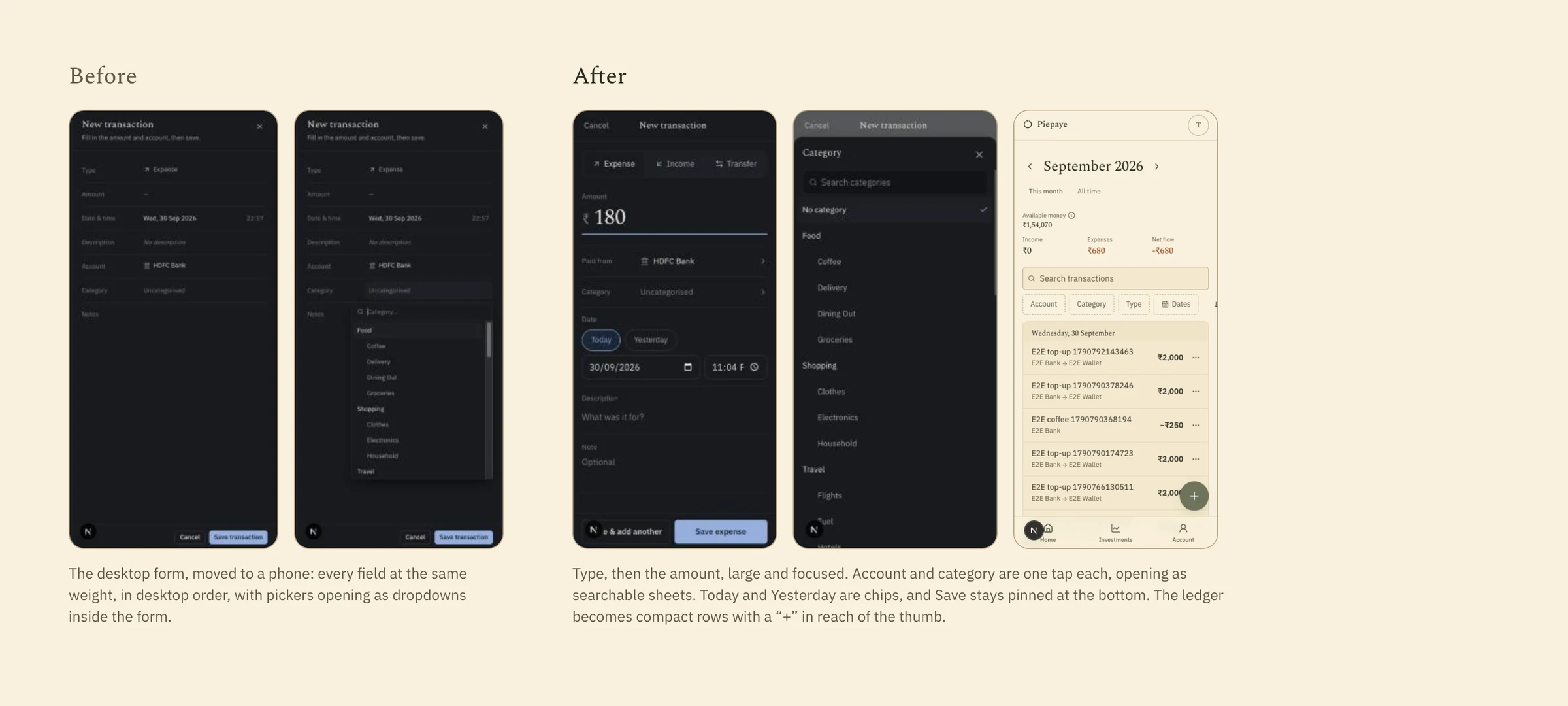
On a phone, the squeezed desktop form made the most important action the hardest one.

Every field had the same weight, and pickers opened as cramped dropdowns. My brief for the mobile pass said the desktop interaction “should NOT simply be compressed onto a phone.”

You usually record on a phone right after spending, one-handed, with the amount in mind. So entry moves into a full-screen composer: the type, then the amount, large, with a numeric keypad; account and category as one-tap sheets; Save above the keyboard. It shares the desktop grid’s draft and validation, so the two never disagree.

Phone screens before and after the mobile pass: a squeezed form, then a focused composer with the amount first.
FIG. 06.1The 30 September mobile pass: the squeezed desktop form, then the composer. Captured before the warm palette.
FIG. 06.2An expense recorded on a phone: the amount, a category, a description, Save. Swipe actions and bulk selection are still desktop-only.
(07) HIERARCHY

The hierarchy starts from the numbers

07 / 09
DECISION 05

Make the amount the heaviest thing on the row

The same ledger with a larger headline figure and amounts heavier than their descriptions.
Ledger where amounts have the same weight as other text.
BeforeAfter
FIG. 07.1The same ledger before and after the hierarchy pass — drag to compare.
Problem

After I moved to a warm palette on the rebuild’s first evening, amounts carried the same weight as the dates and descriptions around them — in a ledger, the one thing the eye should find first.

Reasoning

I flagged it — “the amounts are the same as other text no distinction” — and asked for questions before changes, because bigger numbers were the wrong lever. It needed a rule, not a tweak.

Design response

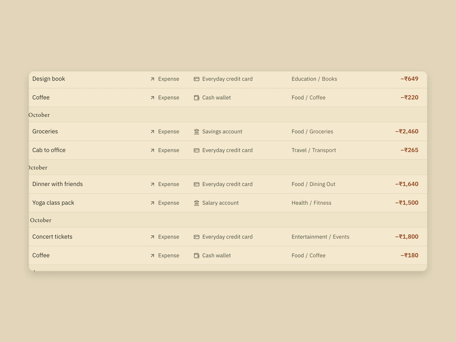
A type scale with explicit roles: row amounts in tabular figures, always heavier than the text beside them. Money colours always travel with a sign, so colour is never the only signal.

Evidence

Captured on 30 September, twenty minutes apart.

Ledger rows with amounts in bold money colour.
Amounts
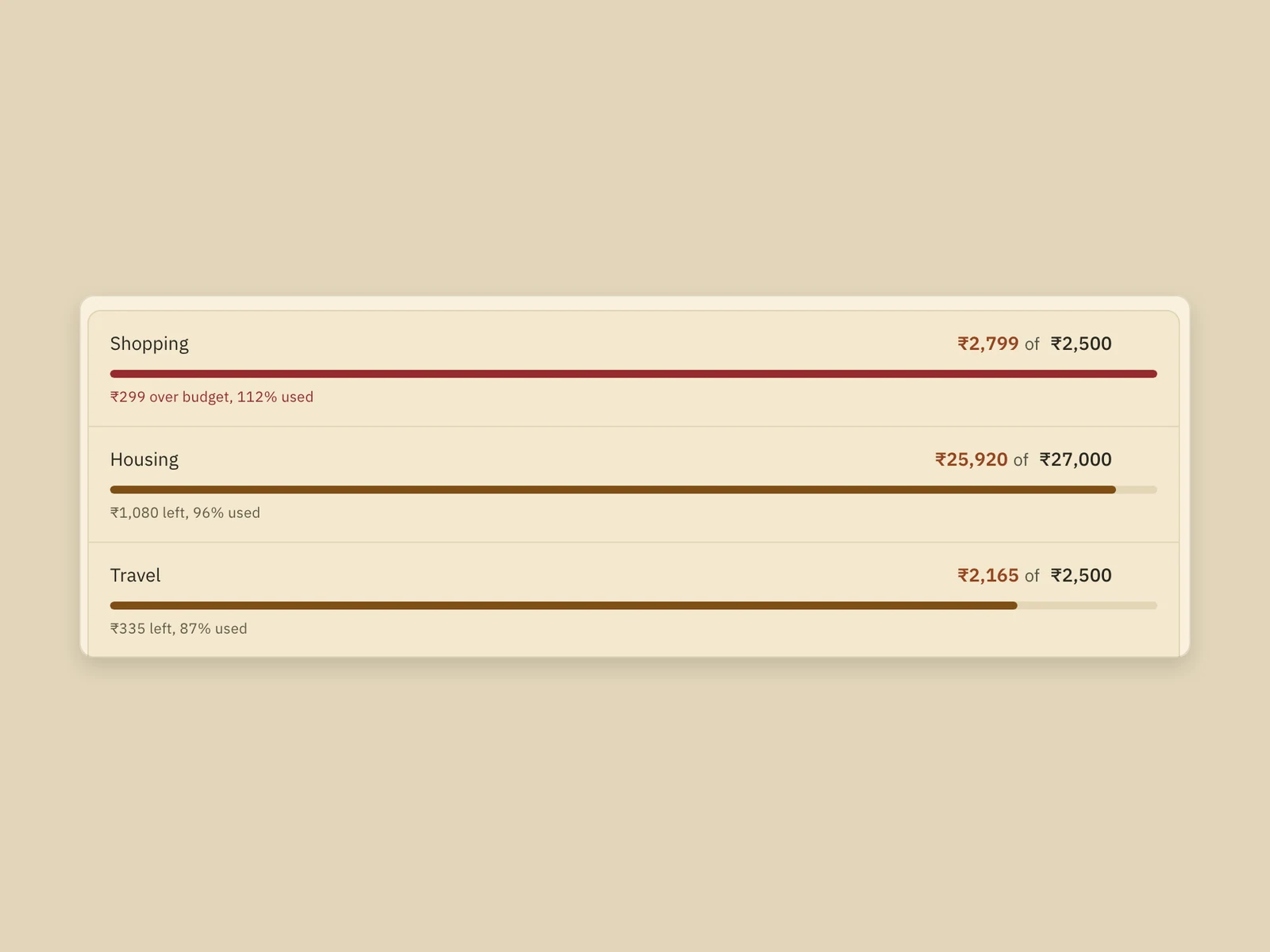
Budget meters for Shopping, Housing and Travel.
Budget meters
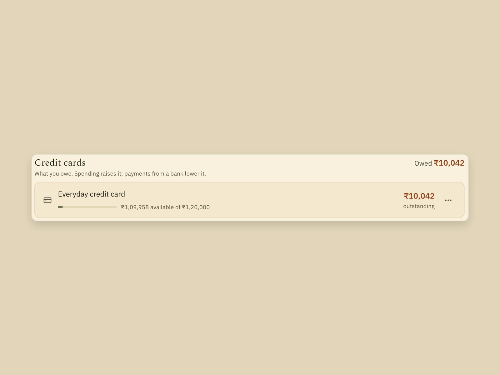
Credit card row: outstanding amount and available of limit.
What you owe
FIG. 07.2The rule applied across the product, in a palette chosen to feel calm rather than urgent: amounts outweigh their labels, budget meters say “over” in words, and a card shows what you owe against its limit.
(08) OUTCOME

What is built, what remains unproven

08 / 09

    What the design made possible

    Three entry types whose meanings hold on every screen; summaries that are always derived, never maintained; and one entry experience shaped separately for desk and phone over the same rules.

    What remains unproven

    There is no user research, testing or usage data. That recording builds awareness — and that fast entry keeps people doing it — is a hypothesis tested only on my own habits. Some money rules are still open, like whether next week’s entry should change today’s balance.

    What I’d do next

    Watch real people keep the habit or drop it. Settle the open money rules, add undo after delete, and design the composer and the grid together from the start.

    How it was built
    AI coding tools wrote the code from my briefs. I defined the product, the model, the money rules and the visual direction, and reviewed every build in the running app.
    Scope
    No bank connections, financial advice, streaks or badges — by design.
    (09) CONTINUE

    Keep exploring

    09 / 09
    NEXT CASE STUDY — 05 · PRODUCT DESIGNDil Ka Kona