Selected work(01) CASE STUDY 02 · WANDERLUSTMOBILE APP — 2023

Every trip leavesa route to follow.(CS—02)

A travel app where every journey someone logs becomes a route someone else can follow.

Wanderlust is a mobile travel app I designed as a course project. Instead of planning a trip from a blank page, you start from a journey someone has already taken — its route, its stops, what it cost — and log your own as you travel, so it can be followed in turn. I designed its flows and interface across 67 screens, from onboarding to an SOS mode.

Year
2023
Role
Product design
Team
Course project
Platform
Mobile app
Read time
4 min
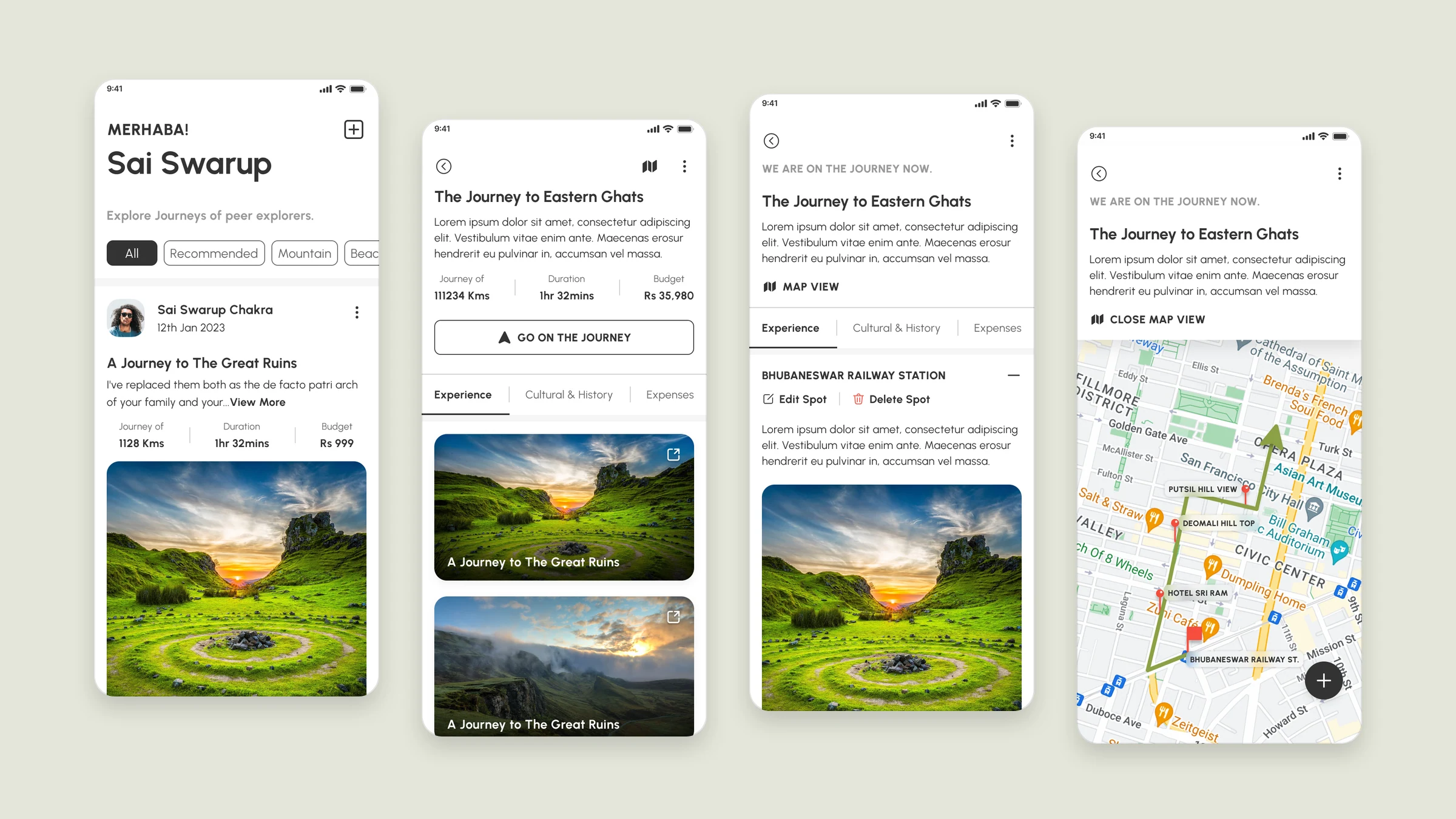
Four Wanderlust screens: the home feed of peers’ journeys, a published journey with distance, duration and budget, a journey in progress with a spot, and its route on a map.
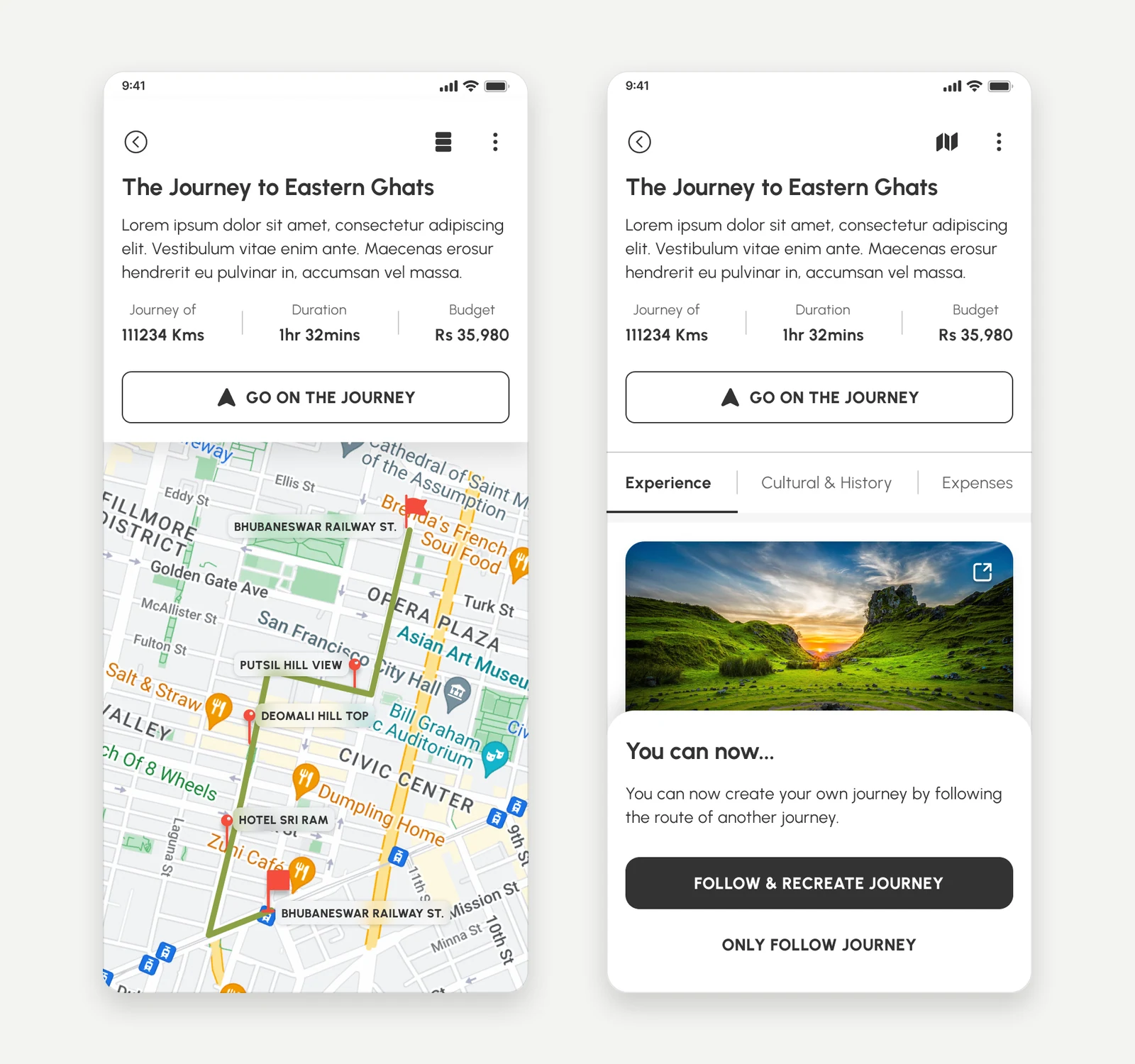
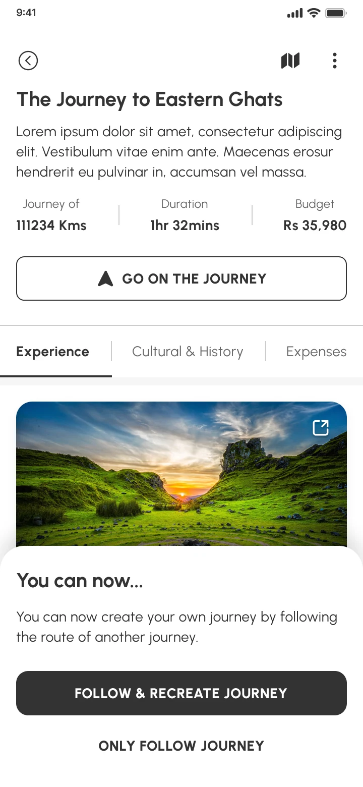
A sheet over a published journey: you can now create your own journey by following the route of another, with Follow & recreate journey and Only follow journey.
FIG. 01.1The feed, a published journey, a journey in progress and its route — and the choice to recreate someone’s journey. Designed screens; the copy is placeholder text and the map a stock image, as in the file.
(02) PREMISE

Planning from a blank page

02 / 10

Planning a trip usually starts from nothing: a destination, a stack of tabs, and a list you assemble yourself.

Yet the most useful plan is often someone else’s trip — the route a friend took, where they stopped, what it actually cost. Wanderlust is built around that idea: a journey is something you take, record and hand on.

(02) THE REFRAME

What if the plan for your trip was a journey someone had already taken?

My framing — the designs record the product, not research behind it.

(03) JOURNEY

The journey is the unit

03 / 10
DECISION 01

Lead with the three numbers a plan needs
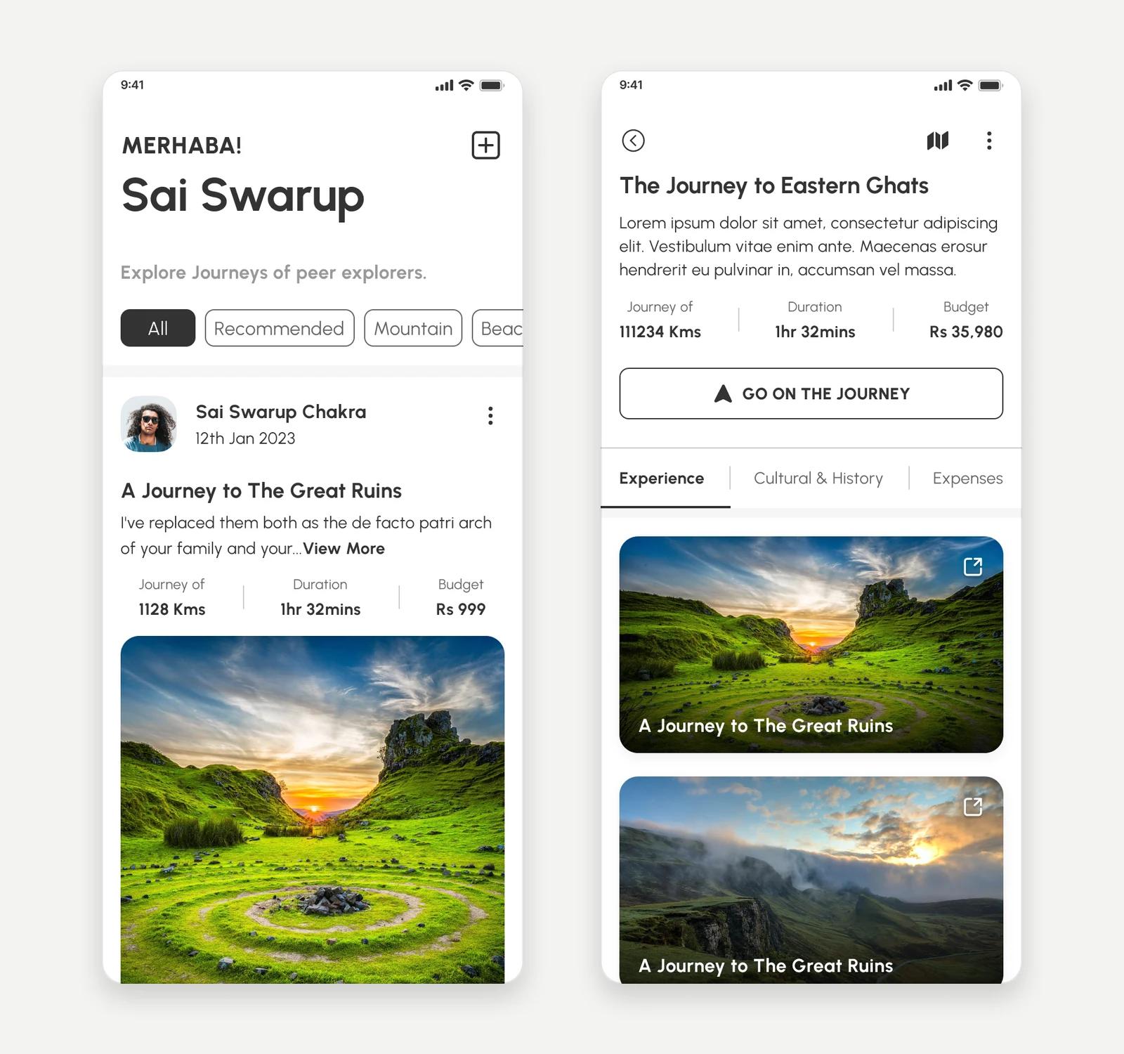
The home feed with a journey card showing journey of 1128 km, 1 hr 32 mins and a Rs 999 budget, beside a published journey page with distance, duration, budget and Go on the journey.
FIG. 03.1The feed and a published journey: distance, duration and budget come before the photos.
Problem

A travel feed of photos shows where someone went, not whether you could go. Deciding needs a sense of distance, time and money before the scenery.

Reasoning

So every journey card carries the same three figures — distance, duration and budget — above its photos, and a journey’s own page puts them under the title, beside its one main action. Photos invite a like; the numbers let you judge whether a trip is yours to take.

Design response

Cards show who travelled and when, a short story, the three figures, then a photo carousel with likes, explorations and save. A journey made with friends shows everyone on it.

Evidence

Seen in the feed and journey screens. Why the numbers lead is my design reasoning; it wasn’t tested.

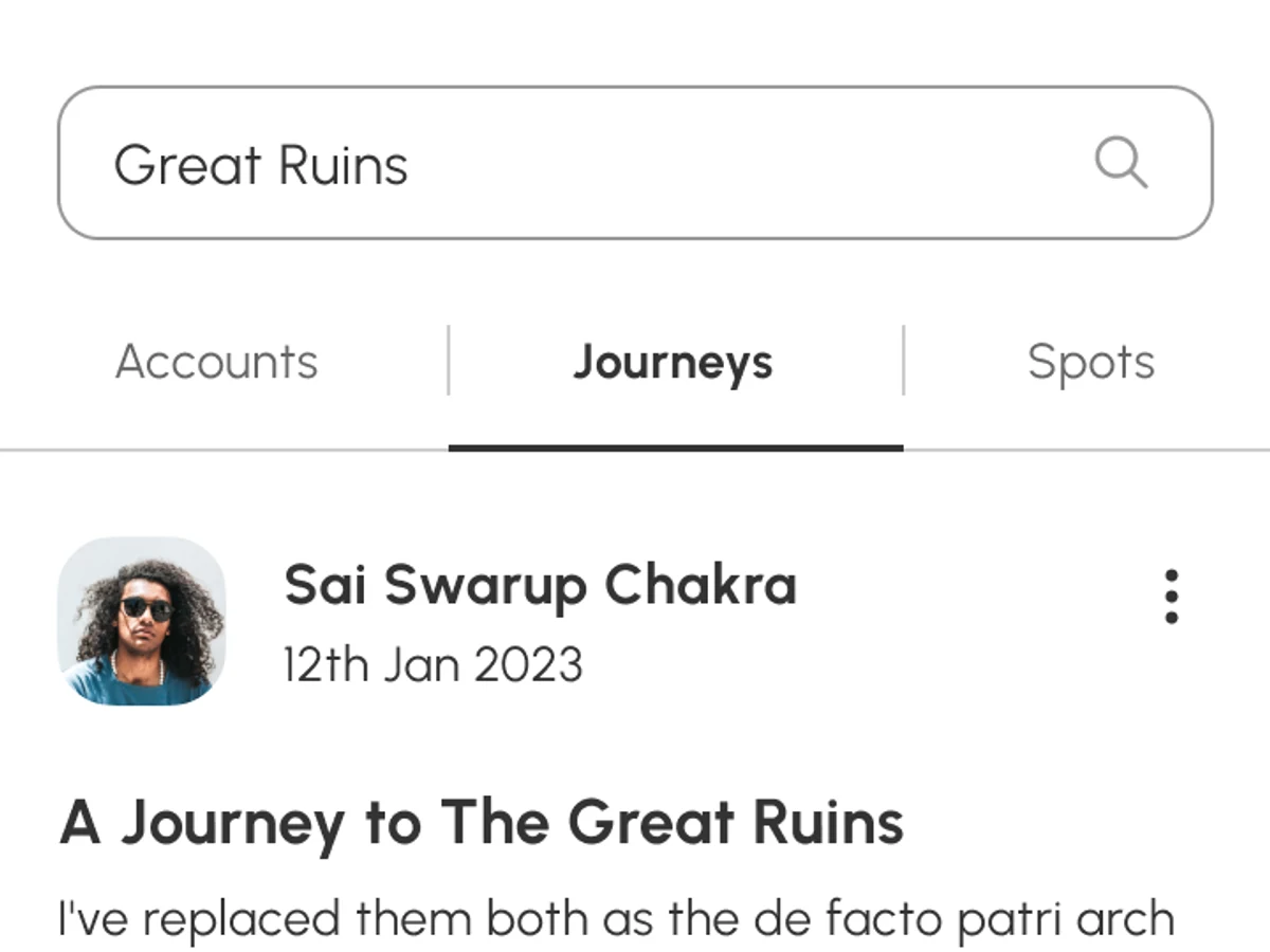
Search results for “Soumya” under Accounts, for “Great Ruins” under Journeys, and as a grid of Spots.
FIG. 03.2Search splits results into accounts, journeys and spots — a place can be found on its own, not only through a person.
(04) ON THE ROAD

Logging while you travel

04 / 10
DECISION 02

Three kinds of note for every stop

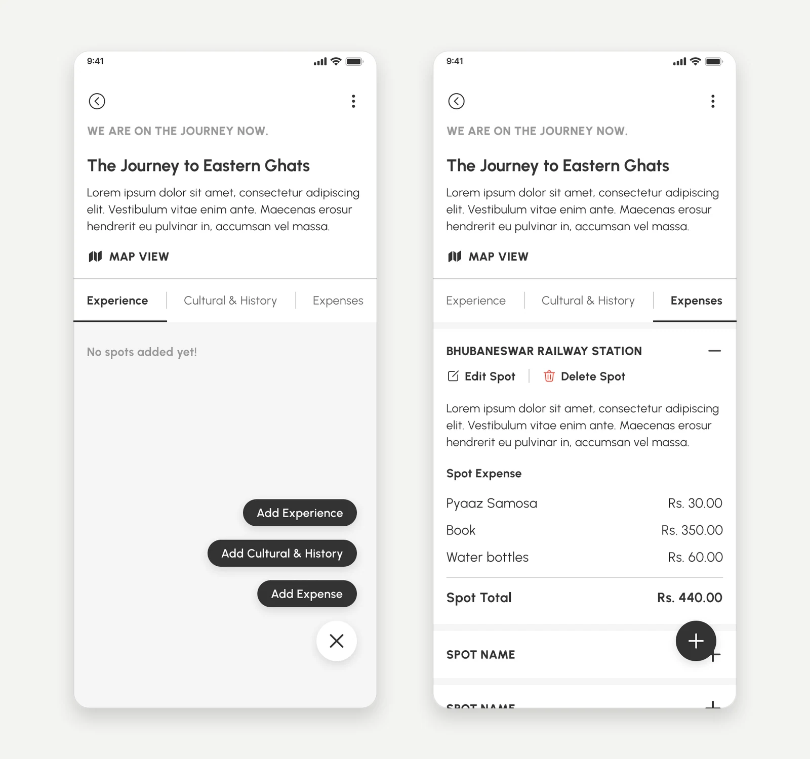
A journey in progress with no spots yet and the + menu open: Add Experience, Add Cultural & History, Add Expense; beside it the Expenses tab with a spot’s items and its total of Rs. 440.
FIG. 04.1One spot, three kinds of note: the + menu, and a spot’s expenses with their total.
Problem

A journey worth following needs more than pins: what you did at each stop, the story of the place, and what it cost. One long form, filled in mid-trip, would be a chore on the road.

Reasoning

So a journey is a list of spots, and each spot takes three kinds of entry — Experience, Cultural & History, Expenses — each with its own tab and short form. You add whichever you have time for; nothing forces all three at once.

Design response

A floating + offers the three. Expenses itemise per spot with a running total; experiences take photos, video and tags. Friends join as collaborators, the map traces the route through every spot, and a journey ends as End & Save, End & Publish or Discard.

Evidence

Seen in the Create Journey flow. The map in the designs is a placeholder image.

FIG. 04.2Designed screens, stepped through: start a journey, add an expense to a spot, then see the route.
(05) FOLLOW

From someone’s journey to your own

05 / 10
DECISION 03

Two ways to follow a journey

A published journey’s route on a map with its stops, beside the sheet “You can now create your own journey by following the route of another journey” with Follow & recreate journey and Only follow journey.
FIG. 05.1A journey’s route on the map, and the choice between following it and recreating it.
Problem

Finding a great trip is where planning usually starts over: copying stops into notes, guessing costs, rebuilding the route.

Reasoning

So a published journey has one primary action — Go on the journey — with two depths behind it. Follow & recreate starts your own journey on the same route; Only follow keeps it to refer to. Copying a plan and committing to it are different decisions, so I kept them apart.

Design response

The sheet says what will happen in plain words: you can create your own journey by following the route of another. The route opens on a map, stop by stop, with the original distance, duration and budget above it.

Evidence

Seen in the journey feed flow. The screens stop at this choice — what a recreated journey looks like isn’t designed.

FIG. 05.2Go on the journey, then the choice — outlined rather than tapped, because the designs stop there.
(06) PREFERENCES

Asking about travel, not just the account

06 / 10

After the account basics, onboarding asks how you like to travel.

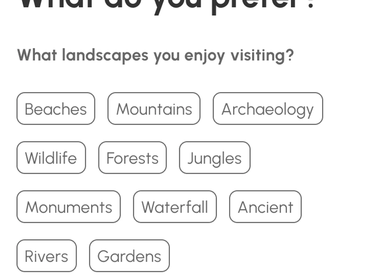
Landscapes you enjoy, how far you want to go, the climate you prefer, and how adventurous you are — on a slider from Tourist to Explorer. They’re one-tap chips rather than typing, the profile picture can be skipped, and every answer stays editable later under Preferences. The feed’s Recommended filter suggests where those answers lead; how recommendations are made isn’t designed.

Onboarding: landscapes and distance as chips; climate chips and an adventurousness slider from Tourist to Explorer; and Your Preferences with the distance question open for editing.
FIG. 06.1Places, distance, climate and pace in onboarding; the same chips return, editable, under Preferences.
(07) SAFETY

Help that’s one tap away

07 / 10
DECISION 04

SOS inside the journey, with an easy way back

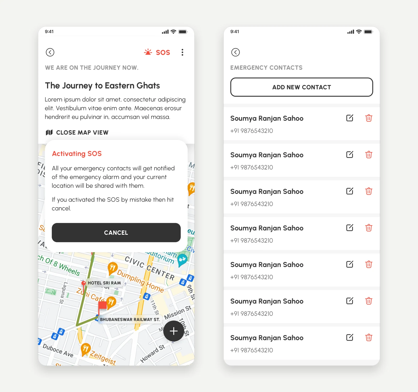
The Activating SOS dialog over a journey’s map with Cancel as the main button, beside the Emergency Contacts list with Add new contact.
FIG. 07.1SOS on a live journey says what it will do and keeps Cancel first; the contacts it alerts are set up in advance.
Problem

Journeys happen somewhere unfamiliar, sometimes alone. Help has to be reachable from the screen you’re already on, and set up before it’s needed.

Reasoning

So while a journey is live, SOS sits in its header, and the contacts it alerts are added beforehand under Emergency Contacts. An accidental alarm is costly too, so the confirmation explains exactly what happens and makes Cancel the main button.

Design response

Activating SOS notifies every emergency contact and shares the current location — “If you activated the SOS by mistake then hit cancel.” Around it, any profile can be blocked or reported under plain categories.

Evidence

Seen in the SOS, emergency-contact and report screens. How alerts are delivered isn’t designed.

FIG. 07.2Designed screens, stepped through: the route, SOS, and its confirmation — Cancel outlined.
(08) SYSTEM

Quiet interface, loud places

08 / 10

The photographs carry the colour, so the interface doesn’t.

Charcoal, greys and white, one rounded sans, and a single olive for what’s active — a followed account, a liked journey, the travel-style slider. A few patterns repeat everywhere: chips for preferences and filters, underlined tabs for a journey’s notes and for search, and the same three-figure summary wherever a journey appears.

Onboarding chips for landscapes: Beaches, Mountains, Archaeology, Wildlife and more.
Chips
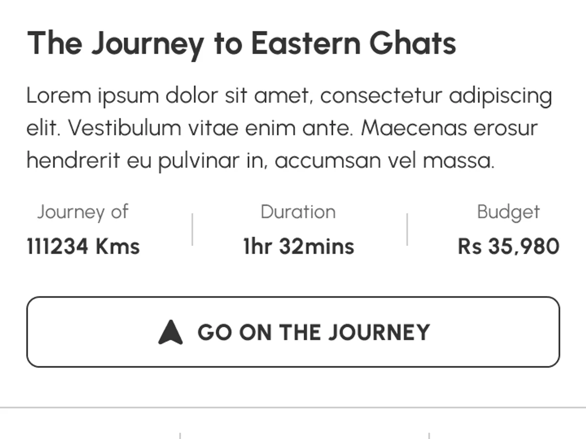
A journey’s summary: journey of 111234 km, 1 hr 32 mins, Rs 35,980, and Go on the journey.
Journey summary
Search with underlined tabs: Accounts, Journeys, Spots.
Tabs
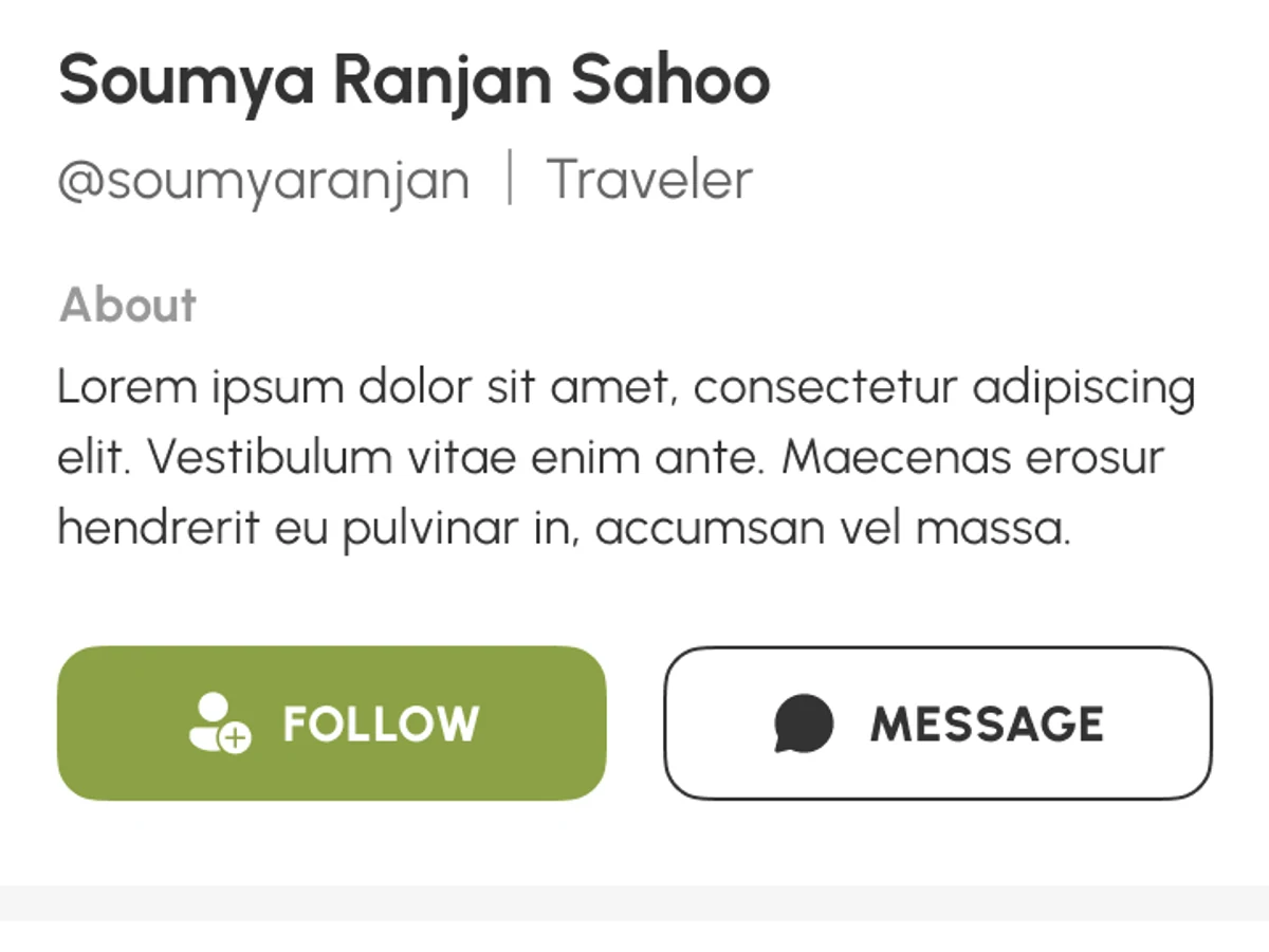
A traveller’s profile with an olive Follow button beside Message.
Active state
FIG. 08.1Chips for answers and filters; the journey summary; underlined tabs; olive for the active state.
(09) OUTCOME

What the designs show, and what they don’t

09 / 10

    What the design makes possible

    A journey that works three ways — a log while you travel, a story in the feed, and a route someone else can follow — with safety built into the trip itself rather than a separate screen.

    What remains unproven

    This was a course project in Figma: no research, testing or build in the material. The copy is placeholder text, the map a stock image, and the screens stop where a recreated journey would begin and where an SOS alert would be delivered.

    What I’d do next

    Test whether distance, duration and budget really help people choose a trip; design the recreated journey and how it differs from the original; and work out SOS without a signal.

    Scope
    67 screens: onboarding, feed and profiles, creating a journey, SOS, the journey feed, search, and help & support.
    Made with
    Figma, as a course project. The motion on this page steps through the designed screens; none of it is a recording of a running app.
    (10) CONTINUE

    Keep exploring

    10 / 10
    NEXT CASE STUDY — 01 · PRODUCT DESIGNHPLUZ